Phone and desktop, same scene
Left: iPhone. Right: desktop. The phone now runs the same scenes.
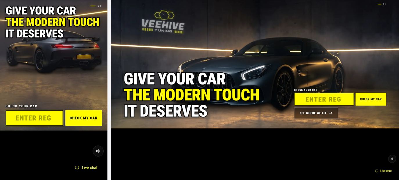
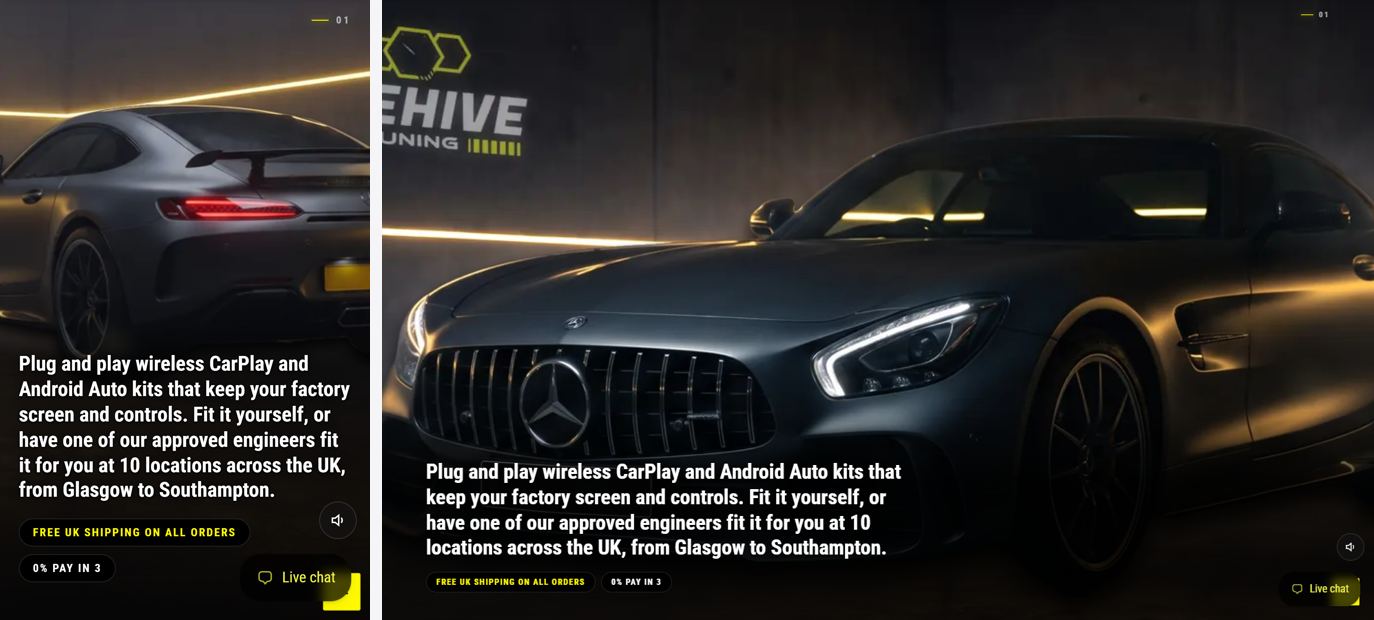
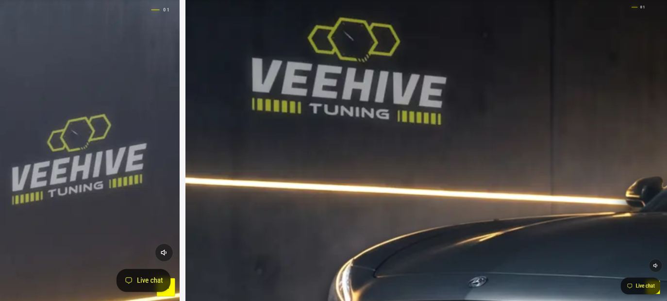


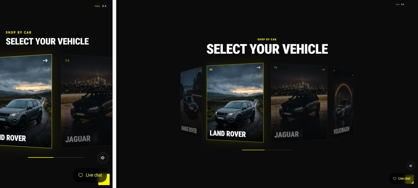
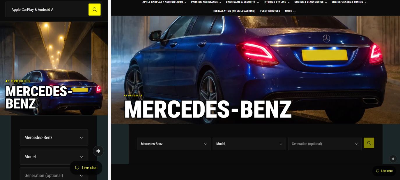
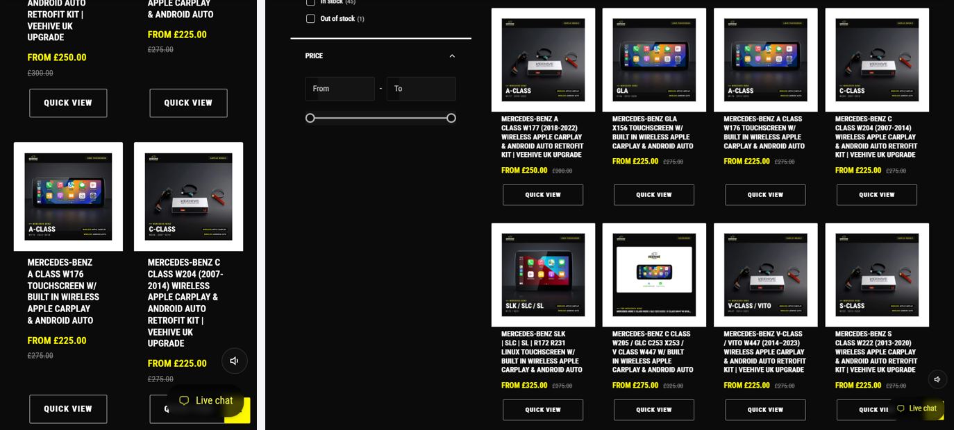
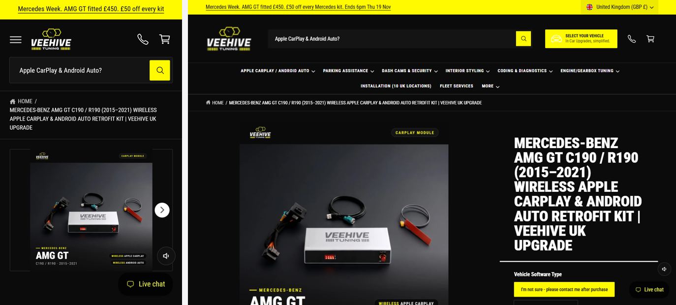
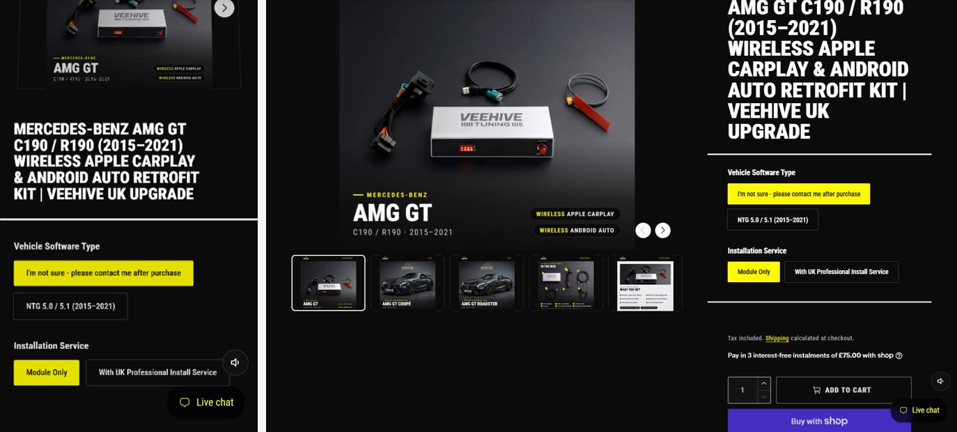
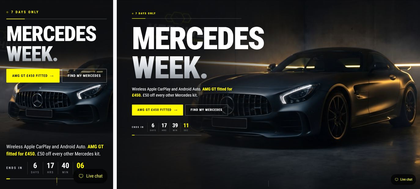
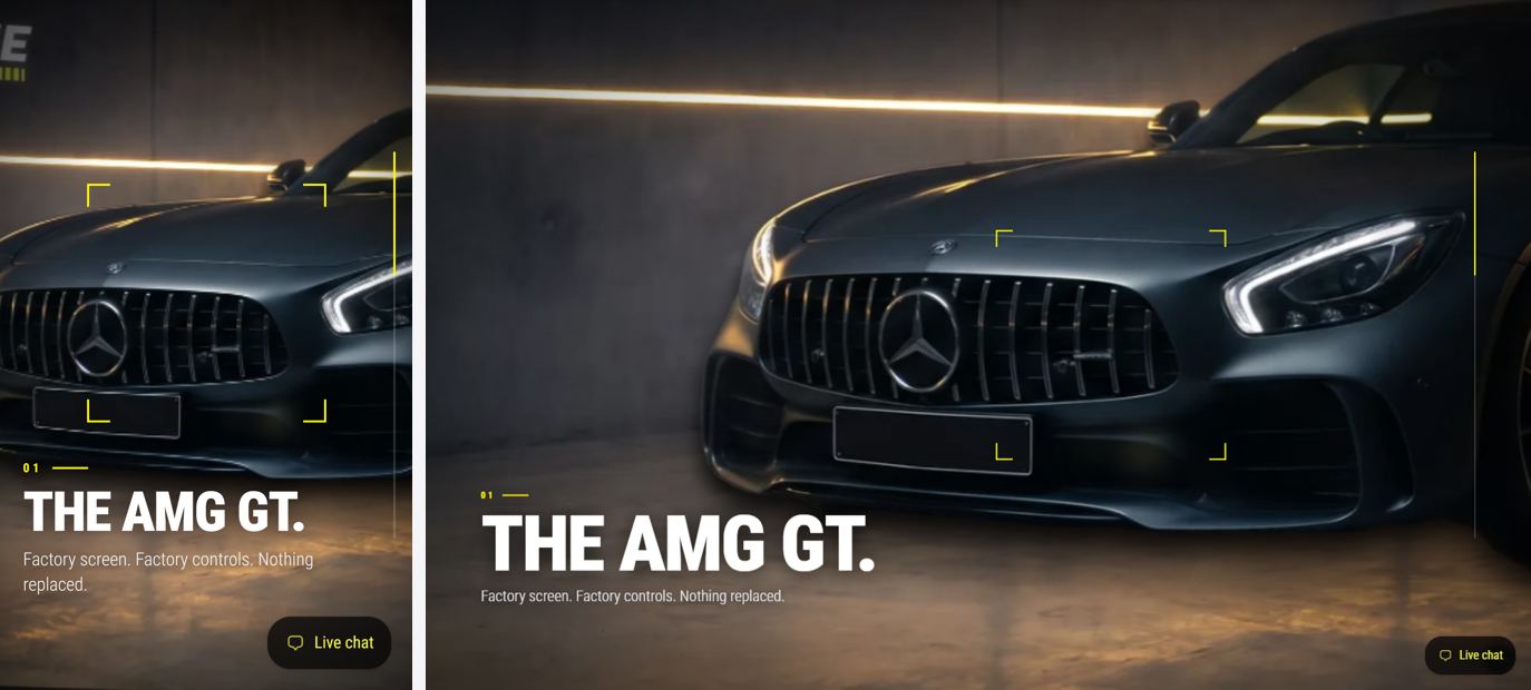
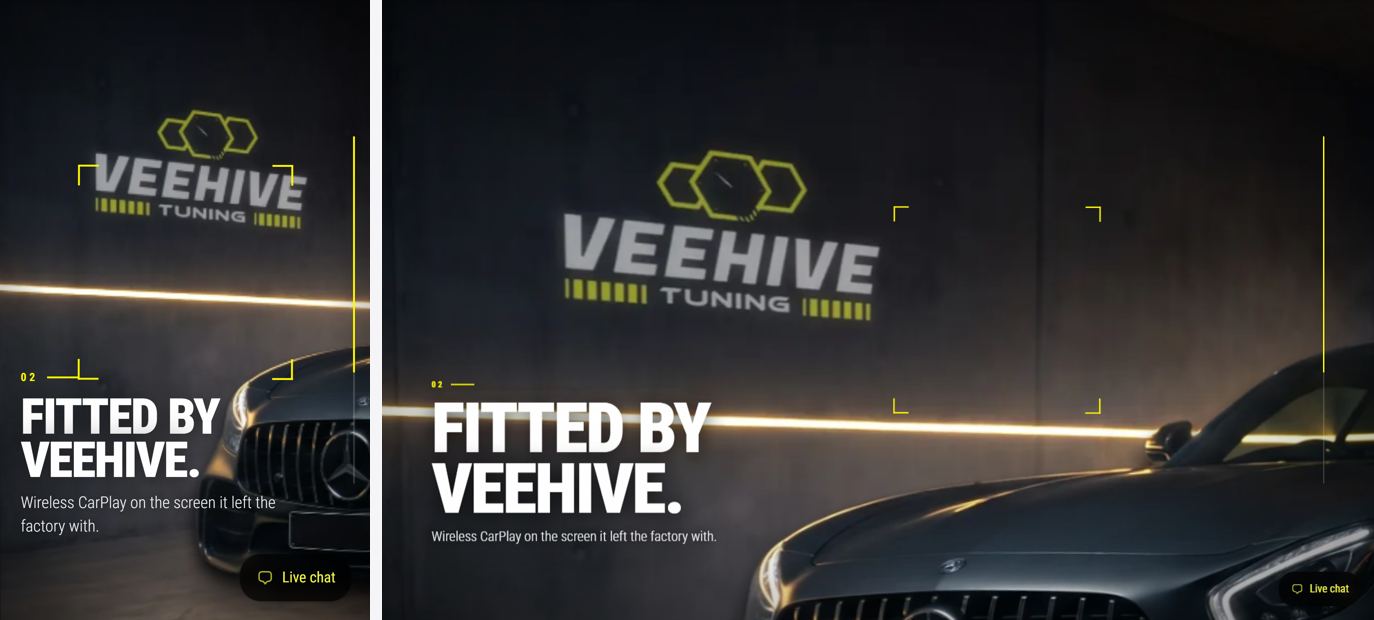
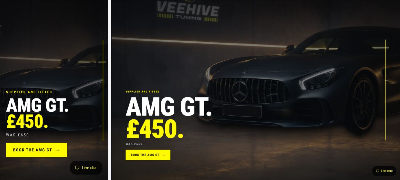
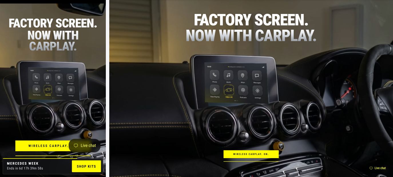
The new website (v2) with Mercedes Week v5 and the new Mercedes media, and the full motion on phones. Recorded with iPhone 15 Pro emulation.
Your store is at Shopify’s limit of 20 themes, so I could not make the candidate copy, and I am not allowed to delete themes. In Shopify admin go to Online Store, Themes, and delete one old unused theme (for example one of the three called “Updated copy of Updated copy of Alpha”). Then tell me “upload A6”: it takes about ten minutes, then you press Publish. Until then, everything on this page is the real live site with the new files swapped in on this PC, so it shows what the theme will do.
Scrolled with real finger drags, top to bottom.
| Check | Result | Detail |
|---|---|---|
| Every model in the picker shows its own kits | Pass | 22 models, 52 kit links, none in the wrong model |
| Homepage still lands on Mercedes Week | Pass | iPhone and desktop |
| "Browse the full VEEHIVE website" button works | Pass | opens the full homepage and stays there |
| Price counters land on the real prices | Pass | AMG GT 450 fitted (was 650) and 50 off |
| Reduced motion shows the final prices straight away | Pass | nothing pinned, nothing moving |
| Header, menu, announcement bar unchanged | Pass | the live v2 files, untouched |
| No console errors from the page (iPhone) | Pass | Mercedes Week, homepage, collection, product |
| Phone gets the full storyboard | Pass | pinned scenes, 3D camera, parallax, ring, reveals |
| Weak phone (2 cores) gets the simple version | Pass | only under 4 cores, under 4GB, or reduced motion |
| No Mercedes star added as a graphic | Pass | the only stars are on the car in the photos |
Frames per second while scrolling, measured back to back against the site that is live now. A long jank would show as frames over 100ms.
| Page | iPhone, finger drags | iPhone, steady scroll | Desktop, steady scroll |
|---|---|---|---|
| Homepage | 53 fps1 over 100ms live site now: 49 fps | 59 fps0 over 100ms live site now: 60 fps | 59 fps1 over 100ms live site now: 59 fps |
| Collection | 51 fps0 over 100ms live site now: 50 fps | 58 fps0 over 100ms live site now: 60 fps | 58 fps0 over 100ms live site now: 57 fps |
| Product | 49 fps0 over 100ms live site now: 50 fps | 60 fps0 over 100ms live site now: 60 fps | 58 fps1 over 100ms live site now: 59 fps |
| Mercedes Week | 60 fps0 over 100ms live site now: 48 fps | 60 fps0 over 100ms live site now: 59 fps | 60 fps0 over 100ms live site now: 59 fps |
Measured in Chrome with iPhone 15 Pro emulation on this PC, not on a real iPhone. Please scroll it on your own phone before publishing.
Left: iPhone. Right: desktop. The phone now runs the same scenes.
You asked for GSAP scroll normalising on iOS. On Mercedes Week it is on. On the rest of the site I tested it and took it out: over the sideways product sliders it trapped the swipe and opened the product instead of scrolling. Those pages pin their scenes with CSS, which phones handle natively, so they do not need it.